A Brand Identity Inspired by Strength and Tradition
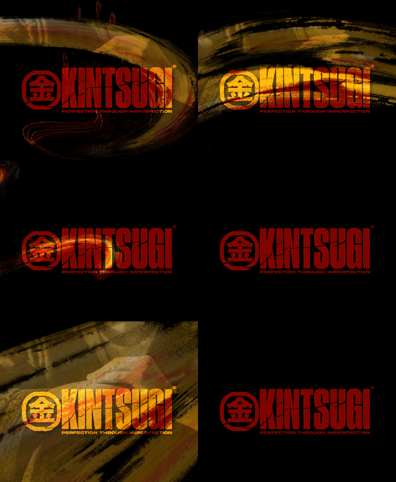
Kintsugi is a Melbourne-based brand specializing in high-quality, fashionable jiu-jitsu gi designed for better comfort and a greater range of motion. Tasked with creating a brand identity that balanced elegance and utility, I developed a scalable design system tailored for apparel, packaging, and marketing materials.
The visual identity draws inspiration from the Japanese art of kintsugi—repairing pottery with gold—symbolizing resilience and beauty. Using a palette of gold, red, black, and gunmetal grey, the logo features bold typography with fluid elements and a subtle integration of the Japanese character for "gold." This thoughtful combination reflects the contrast central to both Brazilian jiu-jitsu and the brand's ethos.
This project allowed me to honor Japanese design principles while crafting a modern aesthetic. The result is a distinctive brand identity that celebrates the sport’s heritage and resonates with both casual and competitive practitioners.
B.east Anniversary Commemorative T-Shirt
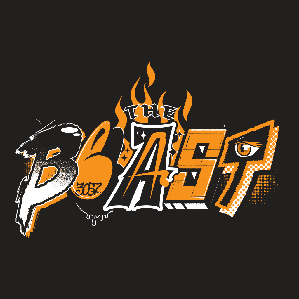
To celebrate over a decade of burgers, bands, and Brunswick vibes, The B.east asked me to design a limited-edition t-shirt for their anniversary event. I created a bold, graffiti-inspired typographic graphic that captured the venue’s fun, chaotic energy while nodding to its local roots in Brunswick East.
The design, made digitally with a mix of lettering styles, was a hit—selling out on the night. This project let me tap into my love of street-style illustration and reconnect with the raw energy that defines Melbourne’s live music and food scene.
A Vibrant Celebration of Melbourne’s Coffee Culture
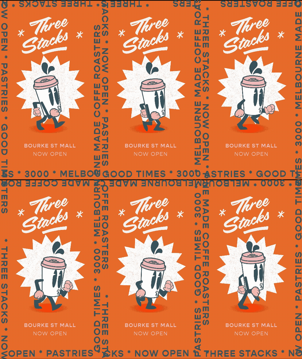
Located in the heart of Bourke Street Mall, Three Stacks Coffee Roasters was designed to encapsulate Melbourne’s iconic laneways, street art, and rich culinary history. The brand identity balanced bold visuals and a welcoming atmosphere to attract a younger demographic while honoring the city’s renowned coffee heritage.
Collaborating with Studio Equator architects, I developed a comprehensive brand experience—from a scalable logo and vibrant mascot to engaging menu designs, merchandise, and social media content. The café’s 18m² space presented a unique challenge, but through thoughtful design and natural textures, it became a compelling destination for discerning coffee enthusiasts.
This project stands out as a career highlight, allowing me to oversee every aspect of brand direction, from ideation to execution. Contributing to Melbourne’s dynamic culinary landscape was a deeply rewarding experience, complemented by working alongside a talented multidisciplinary design team.
Revitalizing a Specialty Coffee Brand for a Contemporary Audience
Studio Beans, a speciality coffee roastery and café eatery, sought a rebrand to create a cohesive brand identity that could cater to its café venues and its flagship plant-based eatery. The goal was to attract a diverse clientele while maintaining its reputation for exceptional coffee in a warm and welcoming environment.
As the lead designer and brand strategist, I began by analyzing the existing brand, and identifying elements to retain and refine. The original logo remained untouched, but I introduced a vibrant secondary colour palette to differentiate locations and products. A sub-brand for the eatery was developed to highlight its sit-down brunch offering, while the other venues focused on takeaway services. The updated visual language also included accessible coffee tasting notes, designed to resonate with both seasoned coffee lovers and casual customers.
The rebrand created a dynamic and personable identity that elevated Studio Beans' market presence. Sustainable packaging and engaging design earned praise from customers, reinforcing loyalty and cementing the brand as a leader in speciality coffee. This project allowed me to embrace the challenge of reworking an existing identity, creating a more cohesive and contemporary brand ready for future growth.
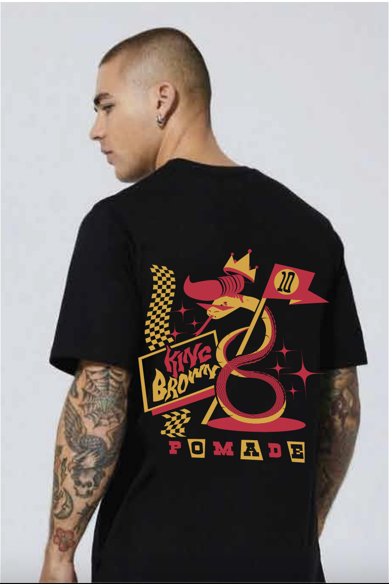
To celebrate a decade of premium grooming products, King Brown invited artists across Australia to create exclusive designs for their 10-year anniversary t-shirt collection. I was honored to contribute to this milestone, crafting a graphic that paid homage to the brand's rich heritage and mid-century influences.
My design reimagined the iconic King Brown snake as a 1950s rockabilly greaser, blending bold, illustrative elements with custom typography. Drawing inspiration from mid-century design and rockabilly culture, the artwork captures the rebellious yet refined spirit of the brand. The typographic design featured on the shirt’s front added a striking, cohesive element to the piece.
This project was a meaningful opportunity to celebrate King Brown's journey and culture. The final design resonated with the brand's loyal customer base and stood out in a collection that showcased the talent of artists from diverse creative backgrounds.
Visual Identity for Melbourne Punk Band
Working with Melbourne-based punk outfit Snark has been an ongoing creative journey. Known for their high-energy, angst-fueled pop punk sound, Snark blends California punk influences with a uniquely Australian edge. Over the years, I’ve collaborated with them to craft a visual identity that echoes their raw, frenetic sound and evolving musical direction.
Using a mix of analogue and digital techniques, I created gritty, tactile imagery enhanced by collage, deliberate distressing, and mass production aesthetics—think halftones, misprints, rips, and grain. A custom bold logotype became a visual throughline across their releases, evolving while maintaining brand consistency.
This body of work reflects both the sonic growth of Snark and my own evolution as an illustrator. As one of the first bands to take a chance on me, I’m forever grateful, and it’s been a blast shaping their aesthetic in sync with their music.
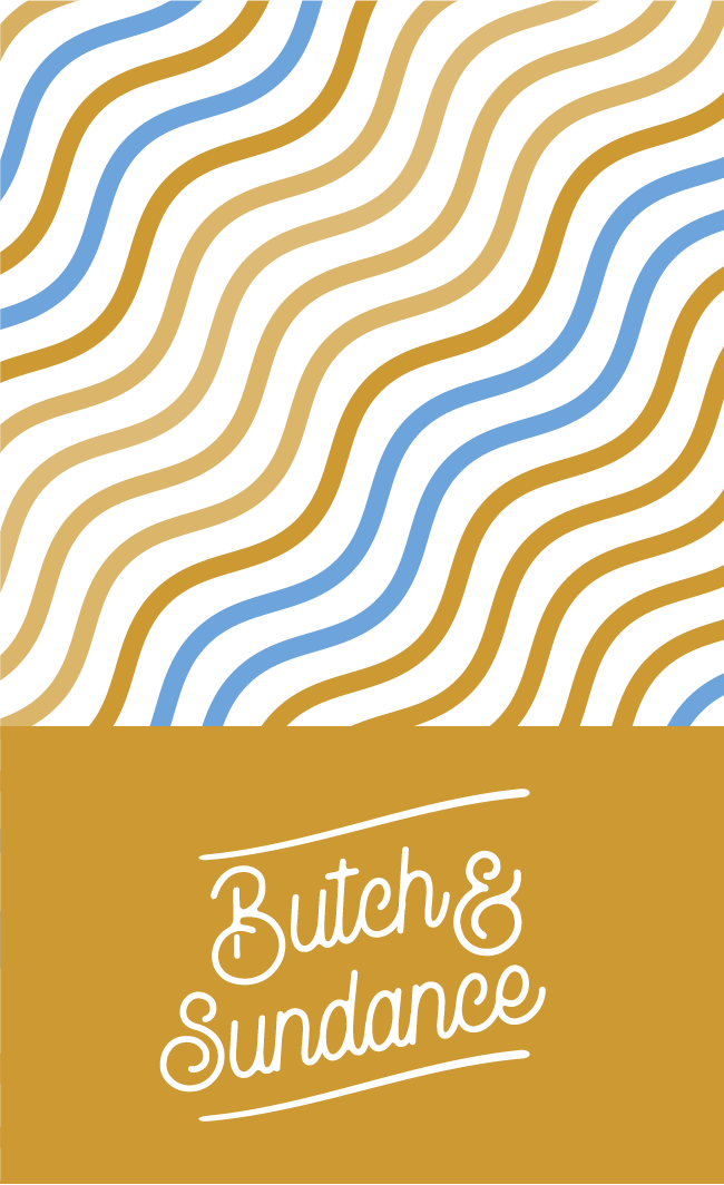
Over the past few years, I’ve developed logos and brand marks for a range of clients—cafes, bars, festivals, pop-ups, and passion projects—each requiring its own distinct voice. This selection showcases my ability to distill big ideas into simple, memorable forms, balancing strategy with craft and personality.
My process combines intuitive sketching with considered refinement, aiming to create marks that feel timeless yet specific. Whether designing for a high-end venue or a DIY music collective, I focus on storytelling, symbolism, and flexibility—building identities that live comfortably across signage, packaging, merchandise, and digital spaces.
Logo design, for me, is the art of reduction—of saying more with less. These pieces reflect my belief that a great mark doesn’t just look good; it becomes a cornerstone for everything that follows.
Blending Nostalgia and Modernity for Caravan Club’s Indie Rock Aesthetic
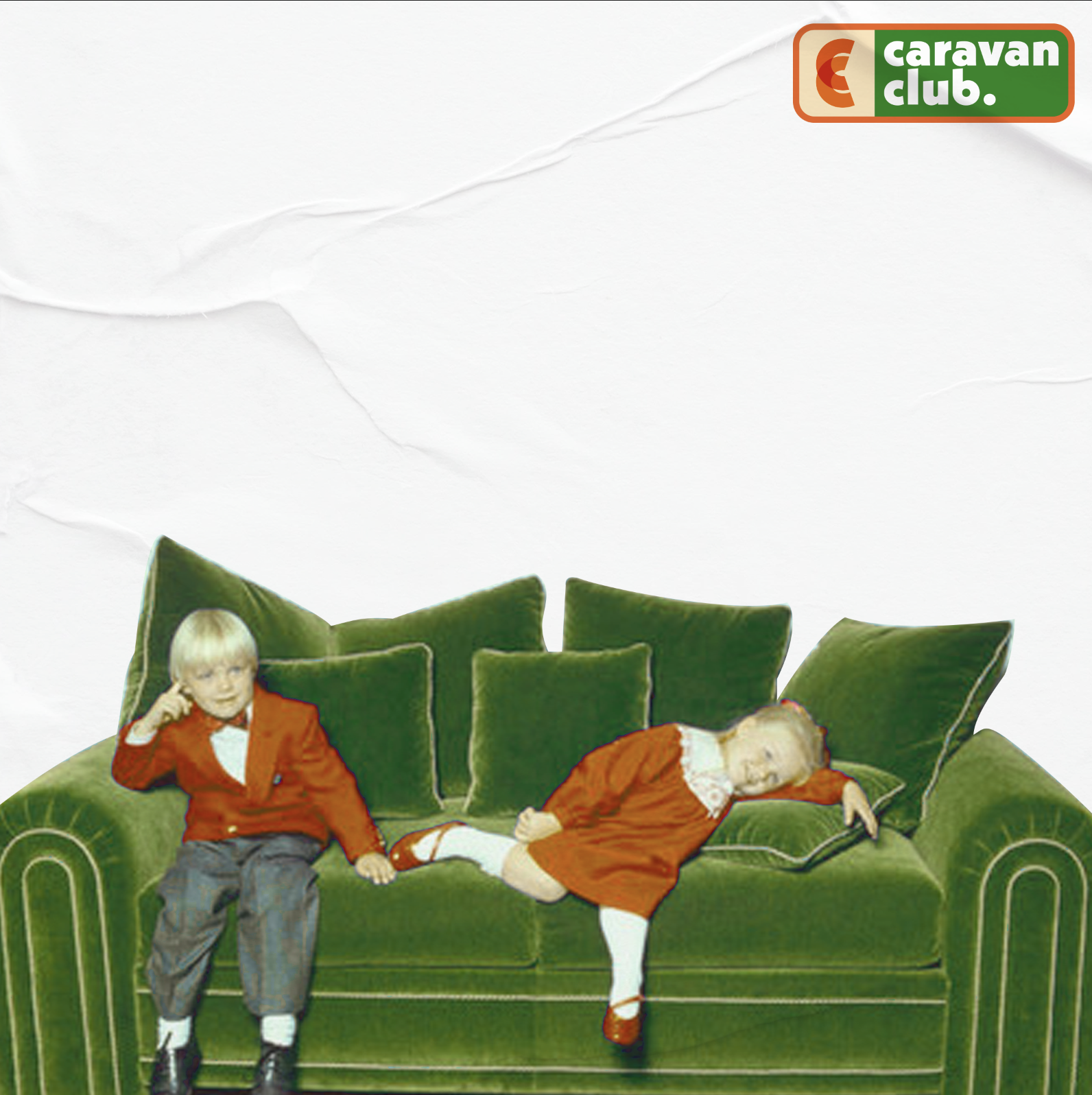
Caravan Club, a Melbourne-based indie rock band, has been a long-time collaborator and a group of friends I’ve had the pleasure of working with for over five years. Our partnership has spanned promotional material and EP cover artwork, allowing us to develop a creative shorthand that makes every project a uniquely rewarding experience.
Designing for musicians offers a fascinating challenge: translating sound into visuals. For each Caravan Club EP cover, the goal was to reflect the mood and themes of their music. Inspired by a blend of nostalgia and ephemera, I focused on remixing vintage aesthetics with modern design sensibilities. By integrating analogue techniques like hand-drawn elements with digital enhancements, each cover stands on its own while maintaining a cohesive visual identity that feels true to the band's sound and spirit.
The results are artworks that not only capture the essence of each EP but also serve as visual extensions of Caravan Club’s music. Their hands-off, trust-filled approach to the creative process has been an honor to work with, allowing me to experiment and push boundaries while crafting covers that resonate with their fans and reflect their evolution as a band.
A Punk Twist on Pizza Culture
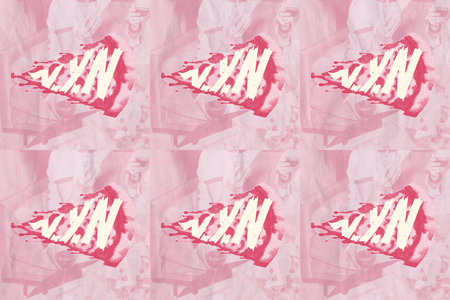
Not Your Nonna’s (NYN) is a Melbourne-based pizzeria that embraces creativity, humor, and an anti-traditional approach to pizza. Created by three foodie friends with no Italian heritage, NYN challenges the norms of pizzerias with a bold, punk-inspired brand identity that reflects their DIY ethos and passion for quality.
Drawing from punk design aesthetics, I crafted a visual language reminiscent of band posters and zines, deliberately subverting classic pizzeria iconography. Collage, distressed textures, halftones, and photocopy effects were paired with an unconventional pink and yellow palette, clashing with the traditional red, white, and green. This playful irreverence was rolled out across uniforms, packaging, menus, and a secret alleyway pop-up in Melbourne’s inner east, relying on guerrilla marketing and word of mouth to build intrigue.
Working with NYN was an inspiring collaboration, allowing me to create something tactile and rebellious.
Vibrant Branding for a Community-First Café
Blessings Café rebranded under new management, shifting focus to plant-based food and specialty coffee with a wellness-driven, community-centric vibe. The challenge was crafting a bold, approachable identity—avoiding anything too “alternative” while still standing out.
I developed a vibrant brand system rolled out across menus, interiors, packaging, and social media, guided by a comprehensive style guide. The real win? Striking the balance between personality and polish, with every brand element working seamlessly together to create a cohesive, welcoming experience.
A Sustainable Brand Identity for Melbourne’s Eco-Conscious Coffee Spot
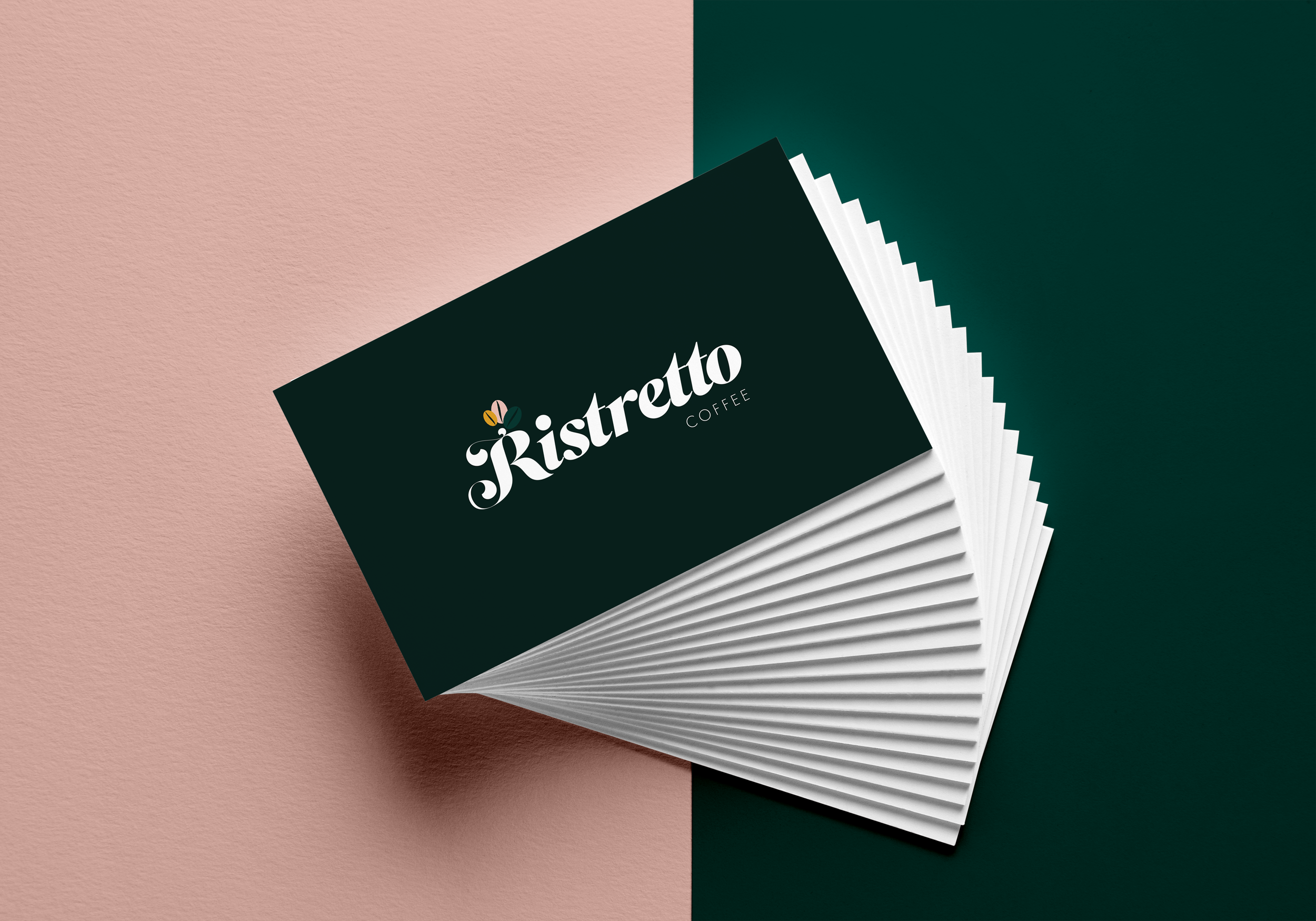
Ristretto Coffee Kiosk, located in the foyer of Origin Energy’s Melbourne office, reflects the building’s commitment to sustainability and energy efficiency. Specializing in fair trade coffee and plant-based dining, the brand required an identity that aligned with the eco-conscious values of its clientele.
The brand design employs a minimalist four-color palette with a versatile typographic logo that can be reduced to a monogram when necessary. To enhance visibility in the kiosk’s open-concept foyer, wraparound signage was implemented, striking a balance between understated elegance and visual impact. Menus, loyalty cards, and social media templates were also designed to maintain brand consistency across all touchpoints.
This project was a rewarding exploration of balancing corporate context with creativity, resulting in a cohesive identity that embodies sustainability while standing out in a dynamic, high-traffic environment.
A Quirky and Vibrant Brand Identity for a Frozen Yoghurt Innovator
Studio Yoghurt, part of the Greater Ventures Group, required a bold and memorable rebrand to distinguish itself as a fun, offbeat alternative to larger frozen yoghurt chains. As the lead designer and brand strategist, I focused on crafting a cohesive identity that resonated with the brand’s youthful, adventurous target audience. The project encompassed concept ideation, brand strategy, the design of a comprehensive style guide, and publication materials for the brand’s annual reports and shareholder documents.
The design featured a clean, minimal aesthetic juxtaposed with cartoony, organic typography and hyper-coloured gradients. Squiggles were introduced as a signature graphic element to tie together all brand collateral, contrasting against a stark, modern in-store design. This visual balance emphasized the brand’s playful personality while maintaining a polished and professional edge for its corporate materials.
The result was a distinctive identity that positioned Studio Yoghurt as a quirky, vibrant destination in the frozen yoghurt space. Working on this project allowed me to explore a unique combination of playful branding and formal publication design. By embracing the challenge of balancing contrasting elements, I created a cohesive identity that speaks to the audience's desires and cements Studio Yoghurt as a standout in its industry.
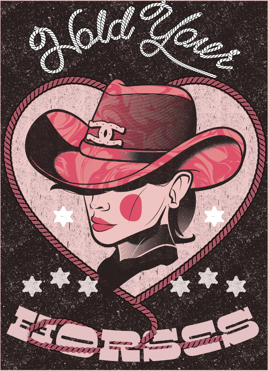
Poster design has long been one of my favourite playgrounds—a space where illustration, typography, and composition collide in loud, expressive ways. This collection spans music gigs, events, and self-initiated work, each piece built to grab attention and carry an atmosphere.
My posters often blend hand-drawn elements with digital finish, pushing contrast, energy, and texture. I lean into bold colour, dynamic type, and layered storytelling to create visuals that resonate from a distance and reward a closer look. Influences range from punk flyers and comic books to vintage cinema and contemporary art.
Vestibulum ornare nulla et turpis volutpat, rhoncus lacinia elit auctor. Quisque luctus purus neque, quis tristique felis venenatis vitae. Nam lobortis orci at erat bibendum, at fermentum ex tincidunt. Donec efficitur ligula at eros maximus mollis.
Cras sed scelerisque purus. Nullam ligula felis, tincidunt interdum bibendum at, rutrum non elit. Quisque cursus pellentesque augue id consectetur. Mauris auctor, turpis vitae porttitor sagittis, orci purus vulputate neque, ut pretium dolor enim eu velit. Quisque hendrerit est vel felis aliquet, sed porttitor turpis congue.