




A Brand Identity Inspired by Strength and Tradition
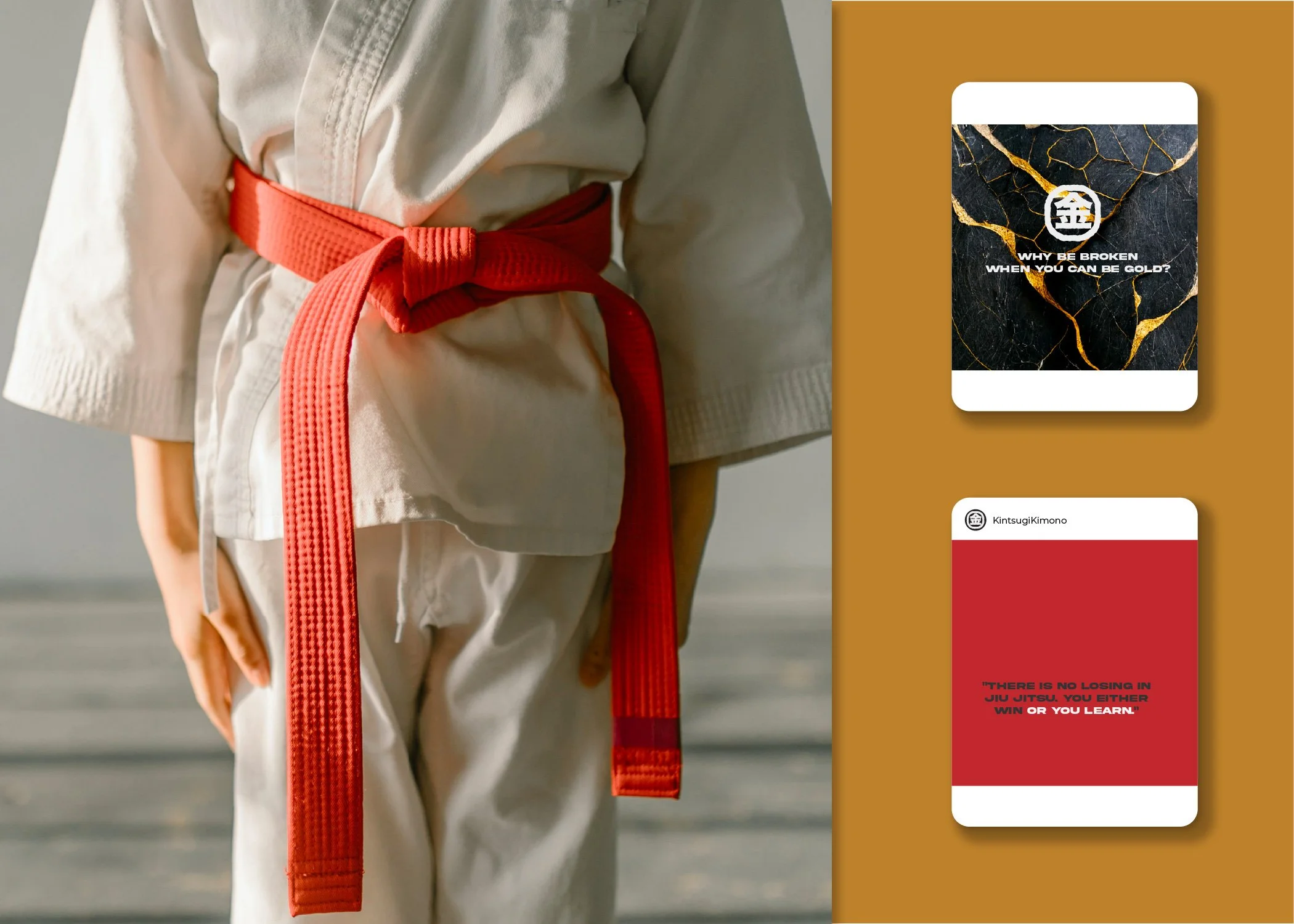
Kintsugi is a Melbourne-based brand specializing in high-quality, fashionable jiu-jitsu gi designed for better comfort and a greater range of motion. Tasked with creating a brand identity that balanced elegance and utility, I developed a scalable design system tailored for apparel, packaging, and marketing materials.
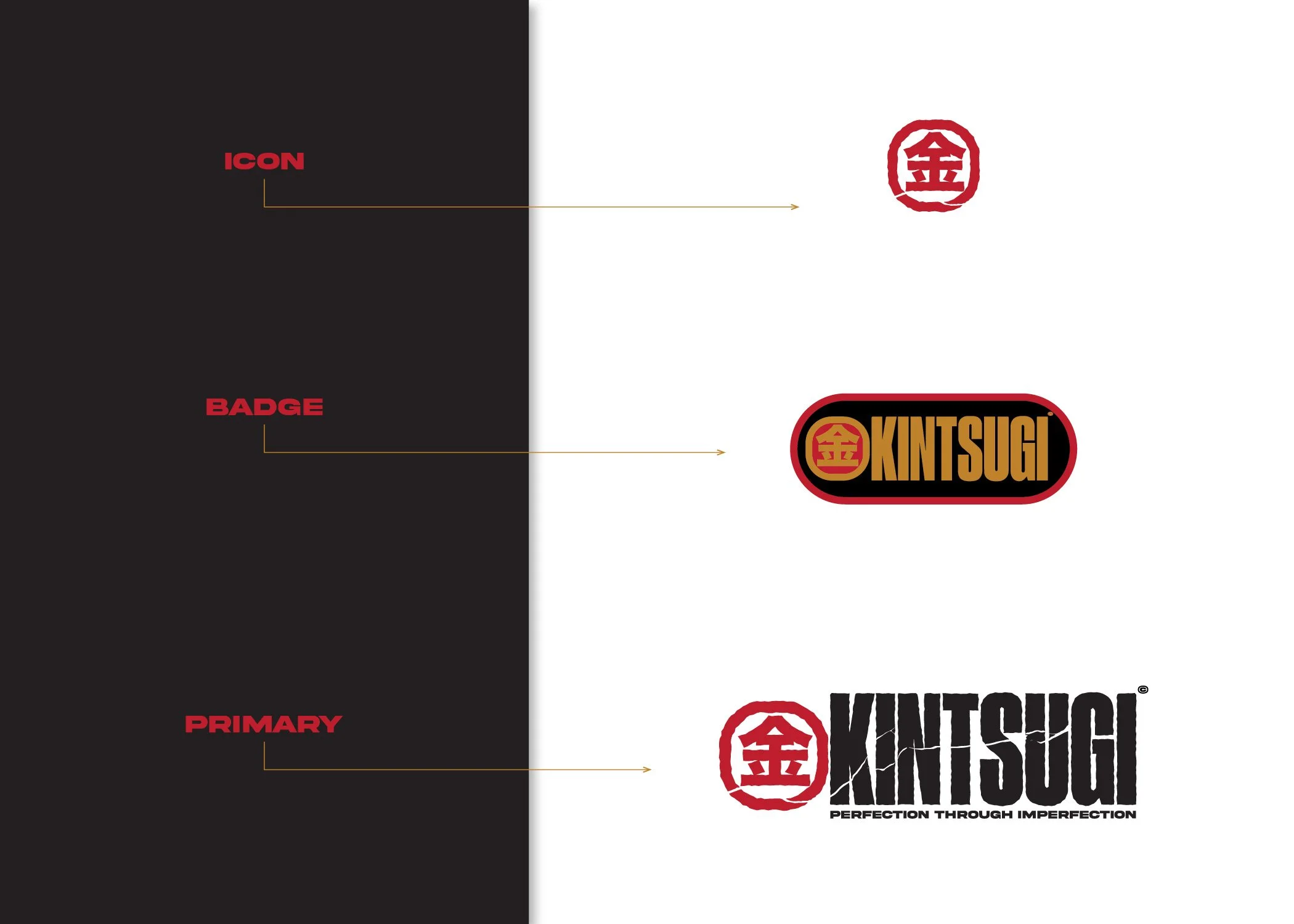
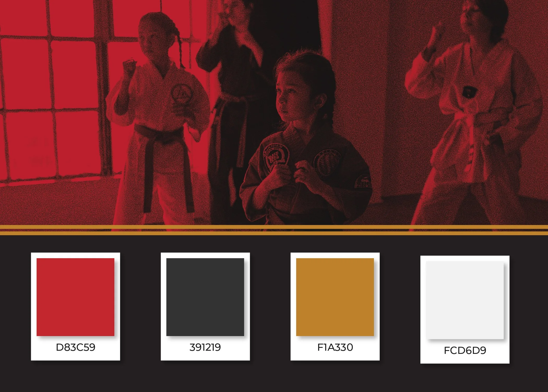
The visual identity draws inspiration from the Japanese art of kintsugi—repairing pottery with gold—symbolizing resilience and beauty. Using a palette of gold, red, black, and gunmetal grey, the logo features bold typography with fluid elements and a subtle integration of the Japanese character for "gold." This thoughtful combination reflects the contrast central to both Brazilian jiu-jitsu and the brand's ethos.
This project allowed me to honor Japanese design principles while crafting a modern aesthetic. The result is a distinctive brand identity that celebrates the sport’s heritage and resonates with both casual and competitive practitioners.